
Process Mining Demystified: A Step-by-Step Guide to Effective Analysis

Summarize:
This blog is the third in a series of blogs called Process Mining Demystified. Before reading this blog, we recommend reading the first blog on connecting and transforming data, and the second blog on creating a Process Mining dashboard.
Once you have successfully imported your data into the application, the next challenge is processing it effectively. The sheer volume of data can be overwhelming at first, but let's explore a step-by-step approach to navigate the tool and leverage prebuilt dashboards for a comprehensive analysis. By following these guidelines, you will be able to gain valuable insights and take informed actions to address any issues encountered.
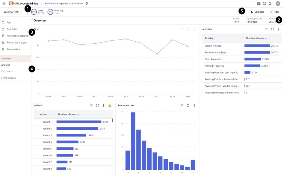
Upon accessing the application, you'll immediately notice several key components on the page.
Cases and Events Donuts: these donuts provide an overview of the number of cases and events ingested into the app.
Filter Panel: the filter button allows you to expand or collapse the filter panel. When expanded, you can add filters and select various fields to refine your analysis.
Out-of-the-Box Dashboards: on the left-hand panel, you'll find a curated list of prebuilt dashboards designed to facilitate different levels of analysis. We'll explore each dashboard in detail later in the blog.
Customizable Dashboards: below the out-of-the-box dashboards, you have the option to create customizable dashboards. With the appropriate permissions, you can add charts and key performance indicators (KPIs) that align with your specific analysis requirements.
Compare Button: adjacent to the filter panel, there's a compare button. Clicking this button transforms the entire dashboard into a comparative view, enabling you to gain insights from different perspectives.
In the upcoming sections of the blog, we'll delve into each of these components, providing a comprehensive understanding of their functionalities and how they contribute to the Process Mining analysis process.
Filtering and filter collections
Filtering plays a pivotal role in the Process Mining workflow, enabling you to slice and dice your data, delve into various components, and uncover meaningful relationships within large datasets. Mastering the art of filtering is crucial for gaining valuable insights. Refer to our docs to understand the full extent of filtering capabilities.
End to end dashboard
The End-to-End Dashboard offers a comprehensive view of your process, starting with the process graph. This graph is the core element of Process Mining, enabling you to identify the optimal flow of your process, as well as any alternative edges and activities.
At the bottom of the graph, you'll find a Details slider. When the slider is positioned all the way to the left, it displays the most common variant of your process, often referred to as the "happy path." By gradually adjusting the slider, you can visualize additional routes and steps that may reveal unexpected patterns. Perhaps you come across instances of rework or nonconforming routes. In such cases, you can right-click on the specific edge or activity and apply a filter to focus on that particular use case. It's important to note that filtering directly from the chart triggers an update across the entire dashboard, ensuring a holistic view of the filtered data.
Process data
If you're keen on visualizing the events associated with each case, you can easily navigate to the Process Details Dashboard. This dashboard allows you to explore individual cases through a comprehensive Gantt chart representation. By examining the Gantt chart, you can gain insights into the duration of each activity within a case.
Tags
Tags serve as powerful tools for incorporating business rules and key performance indicators (KPIs) into your application. By defining these rules during the data transformation phase of your project (as discussed in the article A Guide to Connecting and Transforming Your Data), you can capture various aspects such as inefficiencies, violations, rework, and more.
After creating tags, you can easily examine their trends using the Tags dashboard, located in the top left corner of the page. This dashboard enables you to identify the number of instances associated with each tag within your dataset. For instance, if you are specifically interested in visualizing violations, you can apply a filter to focus solely on these occurrences, refining your analysis to suit your specific needs.
The Tags dashboard empowers you to gain insights into the prevalence and distribution of different tagged events, allowing for targeted analysis and informed decision making based on the identified trends.
Due dates
Are you facing challenges with late payments or the need to track SLAs and understand associated costs? It's crucial to gain an overview of such cases and events to monitor the progress of your process effectively.
To streamline the process and make it easier for you, apps like TemplateOne provide Due Date seed files, which offer additional input data for calculations. To modify the due dates, follow these simple steps:
Export Transformations: begin by exporting the transformations associated with your project.
Unzip and Navigate: unzip the transformation files and navigate to the seeds file within the extracted folder.
Open Duedatesconfigurationraw: Locate and open the Duedatesconfigurationraw file, where you can add supplemental data for your due dates.
Define Due Date: specify the name of your due date using the [Due_date] field.
Define Due Date Cost: determine the cost associated with the due date by using the [Duedatetype] field.
Fixed or Time-Based Costs: indicate whether the due date has a fixed or time-based cost using the [Fixed_costs] field. If set to true, every late event will have the fixed cost associated with it. If set to false, the cost will be multiplied by the number of time increments, the event is late.
Specify Cost: provide the cost value in the [Cost] field.
Time Granularity: If [Fixed_costs] is set to false, specify the time in an integer format using the [Time] field.
Time Granularity Type: specify the time granularity by choosing from options like day, hour, minute, second, or millisecond using the [Time_type] field.
Zip up transformations and import to your app.
To configure the Due Date logic in detail, refer to the instructions provided. These instructions will guide you through the necessary steps to set up Due Date logic effectively.
Root cause analysis
When confronted with a problematic situation, the root cause analysis dashboard is a valuable tool to comprehend the impact of different data fields on the scenario at hand.
To access the dashboard, it's essential to apply a filter within the filter panel, as analyzing a problem requires narrowing down to a specific problem set.
Once you have filtered for a particular scenario, such as extended throughput times, you can proceed to incorporate data to gain insights into its influence.
The root node in the diagram represents the baseline percentage, serving as a reference point. For instance, in the provided image, there are a total of 20,769 cases, out of which 5,429 cases exhibit a throughput time exceeding 14 days. This results in a baseline percentage of 26, which serves as a benchmark for comparison with other field items.
By visualizing and analyzing the root cause analysis diagram, you can effectively explore the relationship between different data fields and understand their influence on the identified problem scenario. This empowers you to delve deeper into the causes of issues and make informed decisions to address them more effectively.
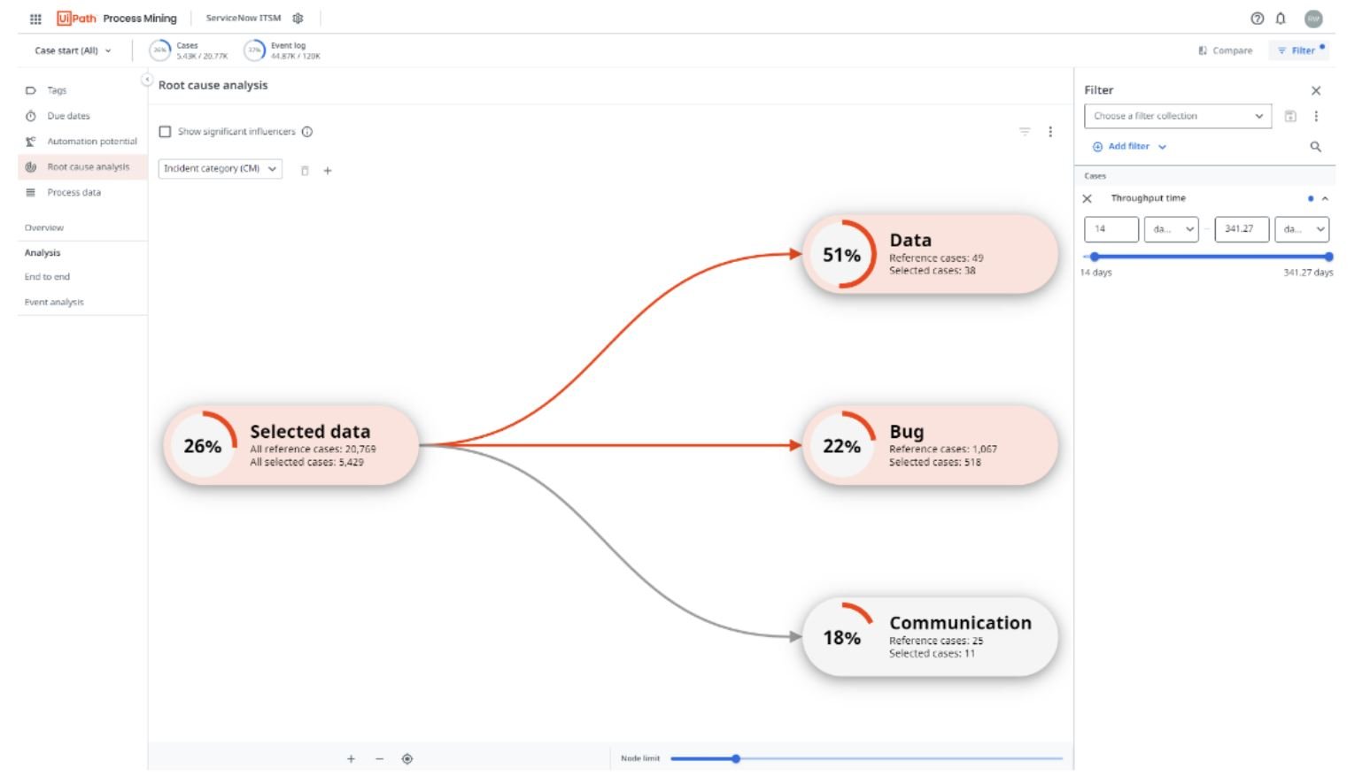
In this particular example, we have three categories of incidents: Data, Bug, and Communication. Let's take a closer look at the Data node, which displays a 51% influence. This influence is calculated based on the node's percentage and the difference between that percentage and the baseline.
For the Data node, out of the total 49 reference cases in the Data Incident category, 38 cases had a throughput time longer than 14 days. This yields a percentage of 77%. Comparing this to the baseline percentage of 26%, we observe a difference of 51%, which is displayed in the node as its influence value.
There are additional capabilities within the root cause analysis dashboard. Check out the functionality in our docs.
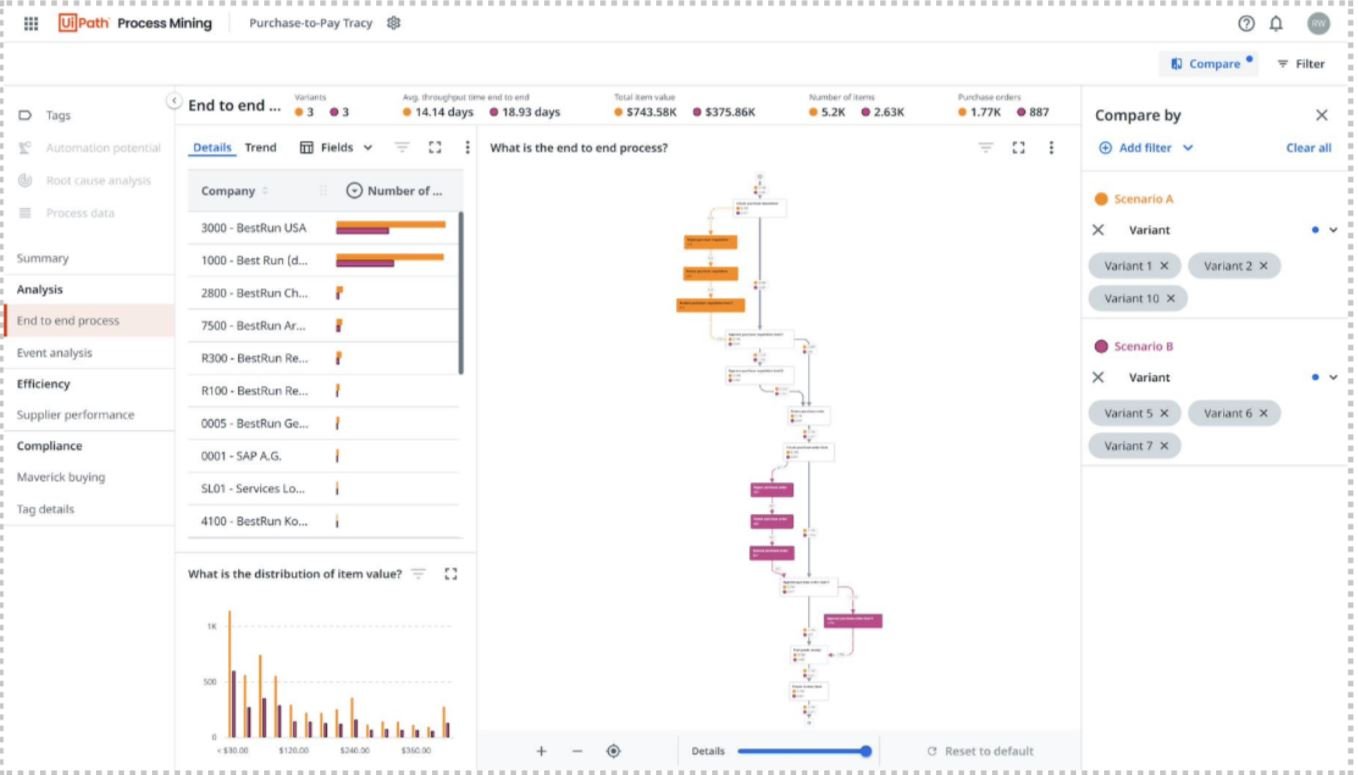
Compare
Tired of the hassle of opening multiple tabs and trying to compare process graphs side by side? With the convenient compare functionality, you can effortlessly analyze and compare two scenarios simultaneously by leveraging filtering.
To get started, simply click on the compare button located in the top right corner of the interface. This action will seamlessly transition you to a distinct, yet similar experience dedicated to scenario comparison.
To customize your scenarios, you can add filters based on specific criteria. Refer to our docs to setup your scenarios.
Now that we’ve gone over all the components of process mining, let’s see it in action in this video.
Topics:
Process Mining
Senior Product Manager, UiPath
Related articles


Get articles from automation experts in your inbox
Sign up today and we'll email you the newest articles every week.
Thank you for subscribing!
Thank you for subscribing! Each week, we'll send the best automation blog posts straight to your inbox.
Get articles from automation experts in your inbox
Sign up today and we'll email you the newest articles every week.
Thank you for subscribing!
Thank you for subscribing! Each week, we'll send the best automation blog posts straight to your inbox.